
COVID-19 Risk – Where are Coronavirus Cases Getting Worse?
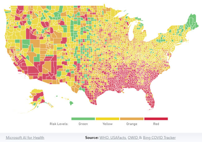
This mapping tool by the Harvard Global Health Institute shows how severe the pandemic is where you live. The COVID Risk Level map shows the current risk level by county according to a seven day average of daily cases per 100k people. Risk levels are then categorized in the following color categories:
COVID Risk Level: Green – On Track for Containment (Less than 1 case per 100k people) – Monitor with vital testing and contact tracing program
COVID Risk Level: Yellow – Community Spread (1-9 cases per 100k people) – Rigorous test and trace programs advised
COVID Risk Level: Orange – Accelerated Spread (10-24 cases per 100k people) – Stay-at-home orders and/ or rigorous test and trace programs advised
COVID Risk Level: Red – Tipping Point (25+ cases per 100k people) – Stay-at-home orders necessary
The cases per 100,000 is a good indicator to show the current picture of outbreaks and compare them consistently across the United States.
Go to https://globalepidemics.org/key-metrics-for-covid-suppression/ for more information.